
Hathaways
This Hathaways rebrand modernizes the company’s visual identity while preserving its legacy, using bold design choices to connect with a new generation and position the brand for future growth.


-
Research examined Hathaway’s existing brand presence, customer experience, and the competitive landscape of local fried chicken restaurants. Insights into menu style, visual identity, and community expectations helped identify opportunities to strengthen the brand’s personality and elevate its overall appeal.
-
Explored visual directions that emphasize Hathaway’s warmth and local character, including refreshed color palettes, bold typography, and playful graphic elements inspired by classic Southern eateries. Multiple logo studies and layout variations were created to shape a brand that feels both familiar and elevated.
-
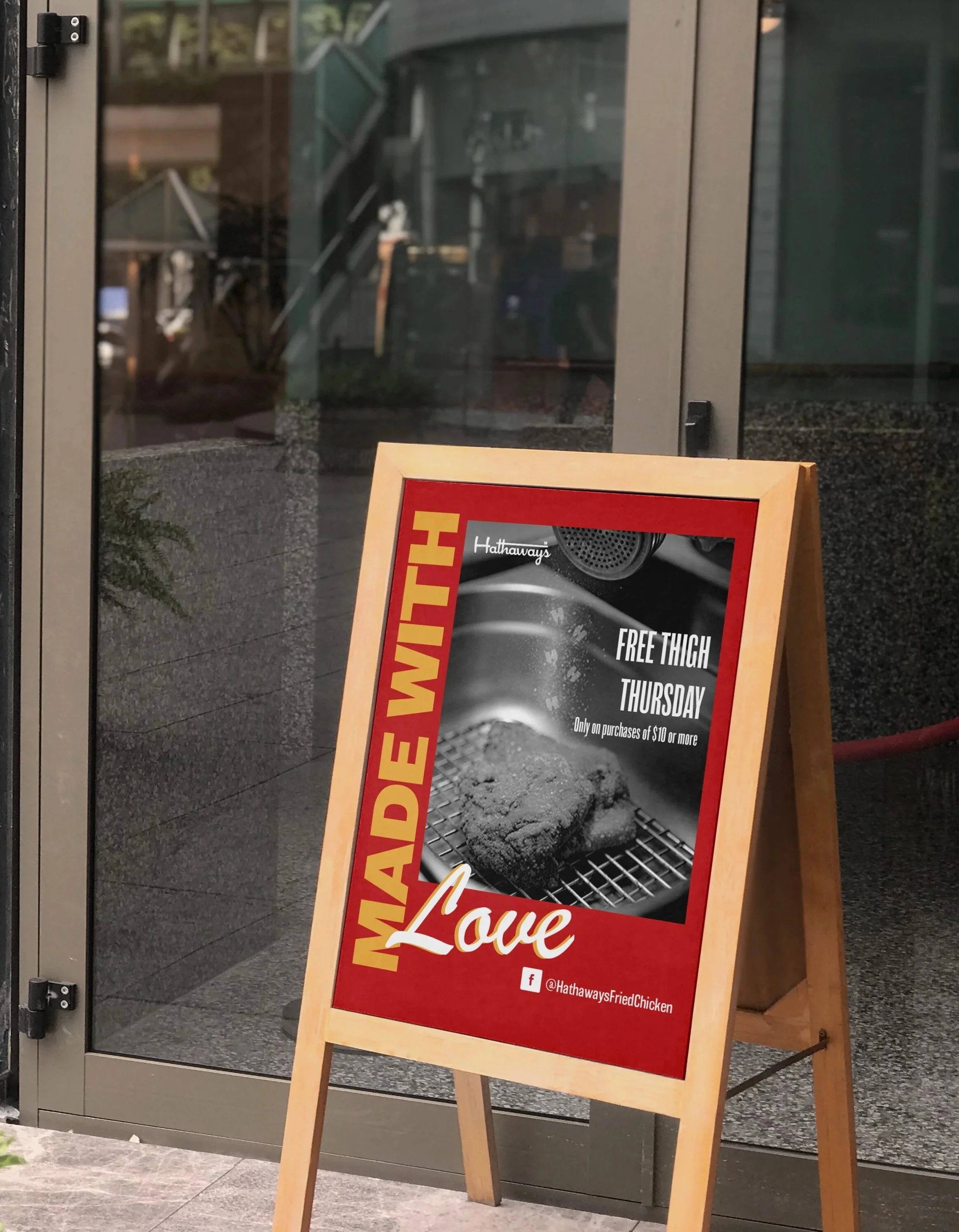
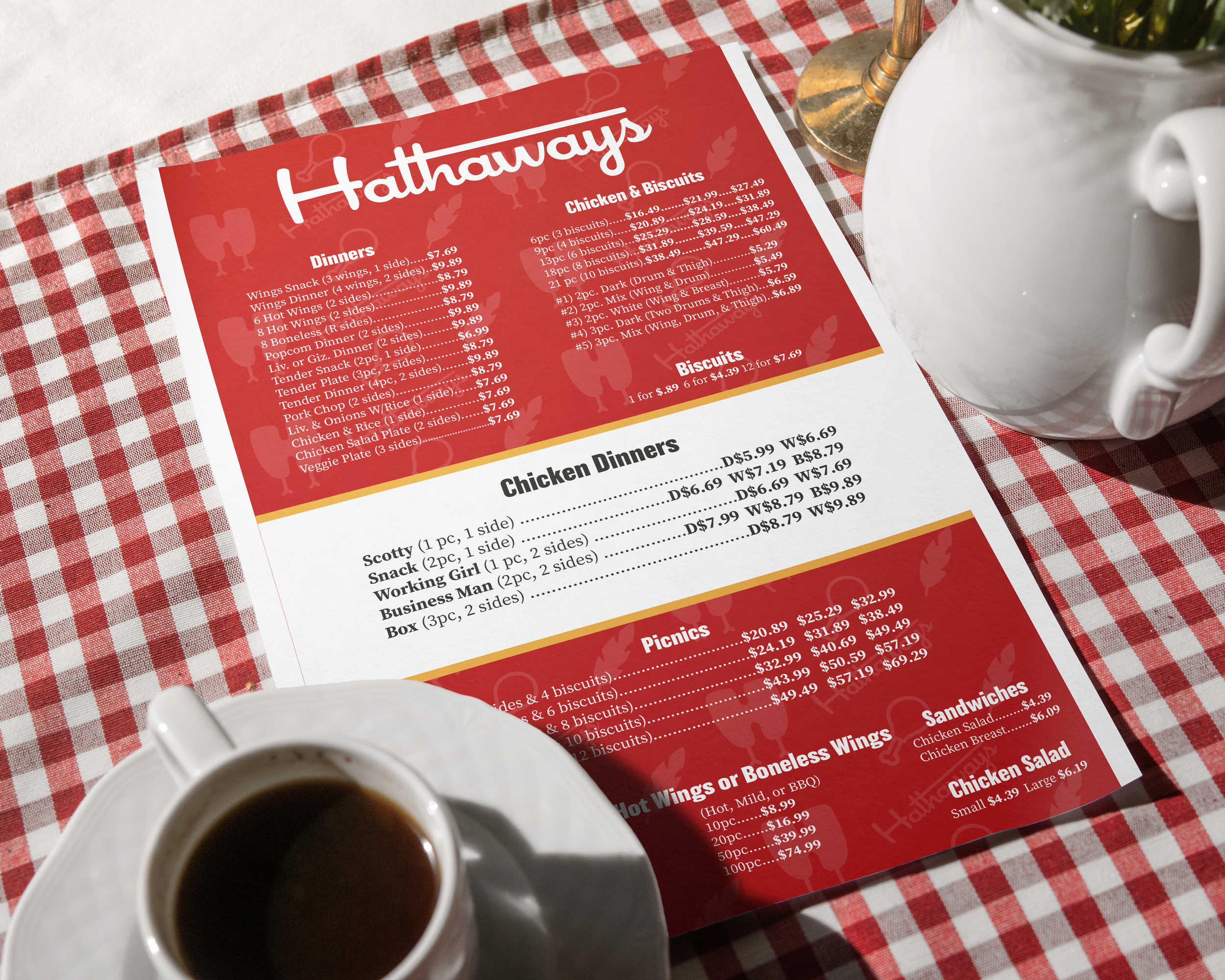
Description text goes hereExecution applied the finalized visual system across menus, stationary, signage, and digital assets. Consistent use of color, typography, and graphic elements created a cohesive brand experience that highlights Hathaway’s warmth, personality, and local roots.